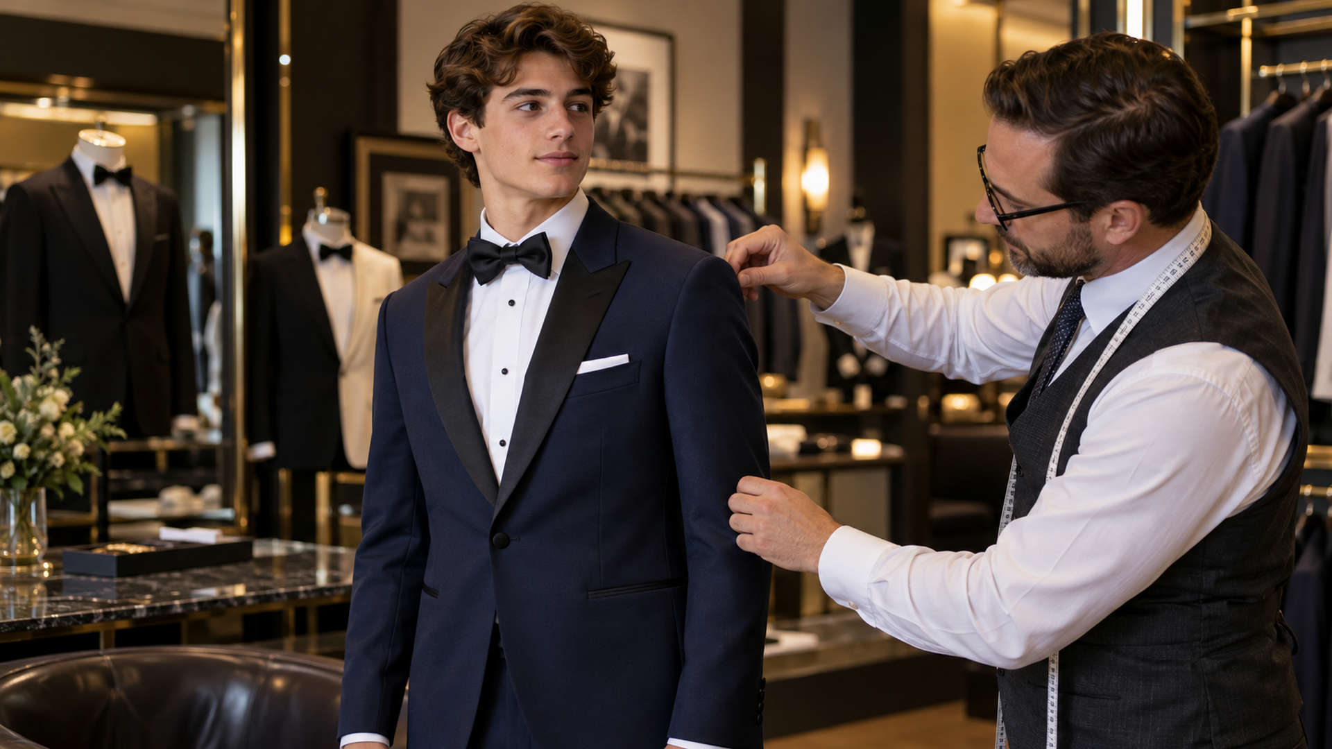
Prom Color Pairings That Look Great in Photos
Prom colors work best when the outfit has a clear foundation and one or two thoughtful accents.
Choose your main color first
Black, navy, and charcoal provide versatile starting points. Decide on the jacket and trousers before selecting ties or pocket squares. This order makes it easier to keep the outfit cohesive and prevents accessories from dictating a look you do not actually enjoy.
Use accents to connect outfits
Burgundy can give navy a rich contrast, while softer green or blush accents can add interest to a neutral suit. Treat these as style ideas rather than fixed rules. The best pairing is one you like and can confirm with the actual fabrics.
Coordinate with a date thoughtfully
Ask whether your date wants coordinated colors. A small reference to their outfit can look intentional without matching every shade. Use a swatch when available; phone photos, filters, and indoor lighting can change the appearance of fabric.
Think about the full photograph
Review shirt, neckwear, pocket square, and shoes together. Several strong colors or busy patterns may compete in group pictures. A simple palette helps the outfit feel connected, but there is still room for a detail that expresses your personality.
Check what is available
Discuss your preferred palette and event date with Elegant Penguin Formal Wear. Ask about current options before committing to an exact color, and try the complete outfit so you can judge both the look and comfort.